「StatusBarの使い方」
これまでStatusBarを使う時は、FormCreate 時にその SimplePanel プロパティを True に設定して、あとは必要なところで SimpleText に表示したい文字列を指定したり、ProgressBar の Parent を StatusBar にして、時間のかかる処理の進捗状況を示したりしてきた。が、今回、いろいろあって TStatusPanels を使って、StatusBar に表示する文字の色を変えたり、背景色を変更する方法を学んだ。これは、その覚書。
1.いちばんカンタンな使い方(SimplePanel:=True;)
2.TStatusPanelsを使う(SimplePanel:=False;)
3.こんなこともできた! (その1) (その2)
4.まとめ
5.お願いとお断り
1.いちばんカンタンな使い方
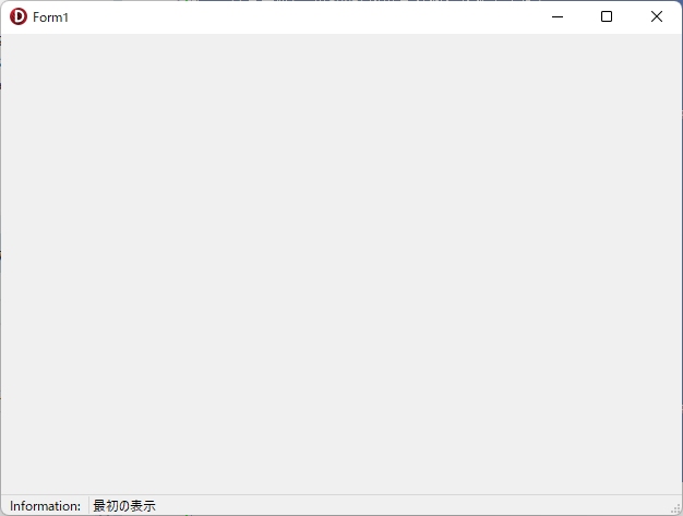
StatusBar のいちばんカンタンな使い方は、SimplePanel プロパティを True (デフォルトは False )にして、StatusBar の SimpleText プロパティに表示したい文字列を指定する方法だ。
以下、いちばんカンタンな使い方の例。
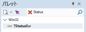
新しいVCLアプリケーションを作成し、適当に名前を付けてプロジェクトを保存して、パレットにStatusと入力、表示されたTStatusBarをダブルクリックする。
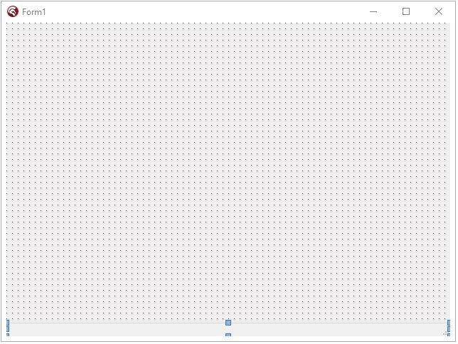
Formのいちばん下に(自動的に位置は指定される)StatusBar1が追加される。
次に、Form をクリックして選択し、オブジェクト インスペクタのイベントタブをクリックして、OnCreate イベントの右の空白部分をダブルクリック。FormCreate 手続きを作成する。で、忘れないうちに次の1行を入力する。
procedure TForm1.FormCreate(Sender: TObject);
begin
  //設定
  StatusBar1.SimplePanel:= True;
end;
StatusBar1.SimplePanel:= True; とすることで、StatusBar1.SimpleText に指定した文字列がそのまま自動的にStatusBarに表示されるようになる(SimplePanel のデフォルト設定は False なので、これを True に変更しておかないと Statusbar への描画は StatusBar1DrawPanel イベントに全て自前で記述しなければ「行われない!」)。
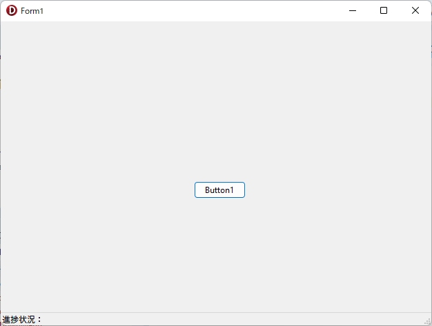
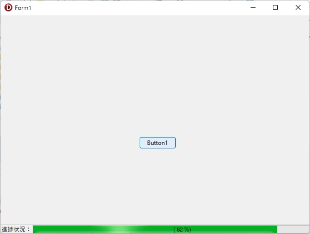
あとは使いたいシーンで、SimpleTextに代入した文字列を表示するようコードを書けばOK! 例えば、「進捗状況:」と表示するなら、FormにButtonを1個追加して、Button1Click手続きを作成し、以下のように記述。
procedure TForm1.Button1Click(Sender: TObject);
begin
  //表示
  StatusBar1.SimpleText:= '進捗状況:';
end;
実行(F9)すれば ・・・
進捗状況を表示するコントロールと言えば ProgressBar。これをFormに追加して、FormCreate 及び Button1Click の各手続きに以下のコードを記述(赤文字が追加するコード)。
procedure TForm1.FormCreate(Sender: TObject);
var
  w: integer;
begin

  //設定
  StatusBar1.SimplePanel:=True;

  //文字列の長さを取得
  w:=StatusBar1.Canvas.TextWidth('進捗状況:');

  //ProgressBarの設定
  with ProgressBar1 do begin
    Parent  := StatusBar1;
    Top     := 2;  //表示位置の調整
    Left    := w;
    Height  := StatusBar1.Height-2;
    Width := StatusBar1.Width-20;
    Visible :=False;
  end;

end;
procedure TForm1.Button1Click(Sender: TObject);
begin
//表示
StatusBar1.SimpleText:= '進捗状況:';
ProgressBar1.Visible:=True;
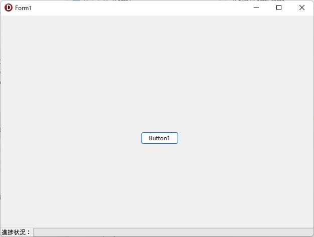
end;保存(Ctrl+S)して、実行(F9)
せっかくここまで書いたのですから、ProgressBarに進捗状況を表示しましょう。以下のコードをButton1Click手続きに追加します(赤文字が追加するコード)。
procedure TForm1.Button1Click(Sender: TObject);
var
  i: integer;
begin
  //表示
  StatusBar1.SimpleText:= '進捗状況:';

  //ProgressBarの設定
  ProgressBar1.Visible:=True;
  ProgressBar1.Position:=0;
  ProgressBar1.Max:=100;

  for i:= 0 to 100 do
  begin
    ProgressBar1.Position:= i; // -> MAXまで表示されない
    Sleep(25);
    Application.ProcessMessages;
  end;
  ProgressBar1.Visible:= False;
  ShowMessage('Done!');

end;
保存(Ctrl+S)して、実行(F9)してみるとわかるのですが、このコードには問題があります。上にすでにコメントとして書いてある通り、ProgressBarのPositionが100まで表示されないのです。機能的には、「処理が進んでいることがユーザーに伝わればいい」ので、それほど大きな問題ではありませんが、表示できるものならやはり100まで表示できたほうが気持ちイイ。
実は少し工夫すれば100まできちんと表示できます。以前、どこかWeb上の情報で知ったのですが、Loopの中で増加する i の値をそのままProgressBarのPositionに代入せず、現在の i 値より「1大きな値をまず代入」し、その後、「1小さい値をセットしなおす」という技です。どなたが考えた技か知りませんが、これで100まできちんと表示できます。以下に、そのコードを示します(赤文字が追加するコード)。
procedure TForm1.Button1Click(Sender: TObject);
var
  i, j:integer;
begin
  //表示
  StatusBar1.SimpleText:= '進捗状況:';

  //ProgressBarの設定
  ProgressBar1.Visible:=True;
  ProgressBar1.Position:=0;
  ProgressBar1.Max:=100;
  //初期化
  j:= 0;
  for i:= 0 to 100 do
  begin
    //ProgressBar1.Position:= i; // -> MAXまで表示されない

    // 100まで表示するコード
    inc(j);
    If ProgressBar1.Position < ProgressBar1.Max Then
    begin
      //目的の値より一つ大きくしてから、目的の値にする
      ProgressBar1.Position:= j + 1;
      ProgressBar1.Position:= j;
    end else begin
      //最大値にする時
      //最大値を1つ増やしてから、元に戻す
      ProgressBar1.Max:= 100 + 1;
      ProgressBar1.Position:= j + 1;
      ProgressBar1.Max:= 100;
      ProgressBar1.Position:= j;
    end;
    Sleep(25);
    Application.ProcessMessages;
  end;
  ProgressBar1.Visible:= False;
  ShowMessage('Done!');

end;
さらにLabelを使って、次のような表示の追加も可能です。FormにLabelを1つ追加して、次のコードを FormCreate と Button1Click の各手続きに追加します(赤文字が追加するコード)。

procedure TForm1.FormCreate(Sender: TObject);
var
  w: integer;
begin

  //設定
  StatusBar1.SimplePanel:= True;

  //文字列の長さを取得
  w:=StatusBar1.Canvas.TextWidth('進捗状況:');

  //ProgressBarの設定
  with ProgressBar1 do begin
    Parent  := StatusBar1;
    Top     := 2;  //表示位置の調整
    Left    := w;
    Height  := StatusBar1.Height - 2;
    Width := StatusBar1.Width - 20;
    Visible := False;
  end;

  //LabelをProgressBarの中心に表示
  Label1.Parent:= ProgressBar1;  // ParentがStatusBarでないことに注意する
  Label1.AutoSize:= False;
  Label1.Transparent:= True;
  Label1.Caption:= '';
  Label1.Visible:= False;

end;
procedure TForm1.Button1Click(Sender: TObject);
var
i, j:integer;
begin
//進捗状況を表示するLabelの設定
Label1.Visible:=True;
Label1.Top:= 0;
Label1.Left:= 0;
Label1.Width:= ProgressBar1.ClientWidth;
Label1.Height:= ProgressBar1.ClientHeight;
Label1.Alignment:= taCenter;
Label1.Layout:= tlCenter;
//表示
StatusBar1.SimpleText:= '進捗状況:';
//ProgressBarの設定
ProgressBar1.Visible:= True;
ProgressBar1.Position:= 0;
ProgressBar1.Max:= 100;
//初期化
j:= 0;
for i:= 0 to 100 do
begin
//ProgressBar1.Position:= i; // -> MAXまで表示されない
//値を増やす
inc(j);
If ProgressBar1.Position < ProgressBar1.Max Then
begin
//目的の値より一つ大きくしてから、目的の値にする
ProgressBar1.Position:= j + 1;
ProgressBar1.Position:= j;
end else begin
//最大値にする時
//最大値を1つ増やしてから、元に戻す
ProgressBar1.Max:= 100 + 1;
ProgressBar1.Position:= j + 1;
ProgressBar1.Max:= 100;
ProgressBar1.Position:= j;
end;
//数値でも進捗状況を表示
Label1.Caption:= '( '+IntToStr(j-1)+' %)';
Sleep(25);
Application.ProcessMessages;
end;
ProgressBar1.Visible:= False;
ShowMessage('Done!');
end;保存(Ctrl+S)して、実行(F9)。
Button1Click手続きの最後にある「ProgressBar1.Visible:= False;」をコメント化して表示の状況を確認することもできます。「Label1.Visible:=False;」としなくてもLabelが非表示になるのは、Label1のParentを「Label1.Parent:=ProgressBar1;」としているためだと思われます。
【ヒントをStatusBarに表示する】
引用先には、設定したヒントをことごとくStatusBarに表示するという技が紹介されていました。StatusBar1.SimplePanel プロパティを True に設定して使うのであれば、内容もシンプルで、実際に使えるテクニックだと思います。
http://hp.vector.co.jp/authors/VA015850/delphi/fragments/AppHint.html
以上、いちばんカンタンなStatusBarの使い方でした!
2.TStatusPanelsを使う方法
2つめが、StatusBarがもともと持っているPanelを1つ、または複数個設置して、各々のPanelに対して描画の指示を出すという方法です。
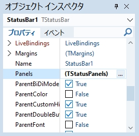
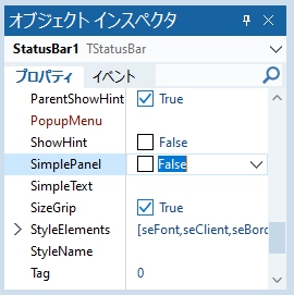
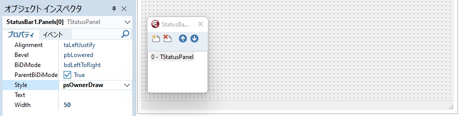
新しいプロジェクトを作成し、FormにStatusBarを1つ、追加します。で、これを選択したまま、オブジェクト インスペクタのPanelsプロパティの(TStatusPanels)の右の…をクリックすると、次のような別Windowが表示されます。
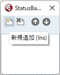
左上の「新規追加」アイコンを2回クリックして、StatusPanelを2つ追加します。
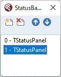
ここではStatusBarに表示する文字の文字色を変えたり、背景色を変更してみたいと思います。「0-TStatusPanel」をクリックして選択し、オブジェクト インスペクタのStyleプロパティをデフォルトの「psText」から「psOwnerDraw」へ変更します。
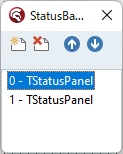
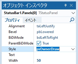
同じ操作を「1-TStatusPanel」にも行います。
これでStatusBarへの描画は「すべて自力で行う」ことになります。
設定したら右上の閉じるボタンをクリックして、設定画面を閉じます。
TStatusPanelをコードで設定する場合は、FormCreate手続きに以下の内容を入力します(赤文字が追加するコード)。
procedure TForm1.FormCreate(Sender: TObject);
var
  w:integer;
begin

  //コードで設定
  //StyleをpsOwnerDrawに変更
  StatusBar1.Panels[0].Style:=psOwnerDraw;
  StatusBar1.Panels[0].Text:='Information:';

  //Panel[0]の幅の調整(表示する予定の文字列で初期化)
  w:= StatusBar1.Canvas.TextWidth('Information:');
  StatusBar1.Panels[0].Width:= w + 15;
  StatusBar1.Refresh;

  //StyleをpsOwnerDrawに変更
  StatusBar1.Panels[1].Style:= psOwnerDraw;
  StatusBar1.Panels[1].Text:= '最初の表示';

end;
保存(Ctrl+S)して、実行(F9)。
よく見ると、StatusBarに StatusBar1.Panels[0] と StatusBar1.Panels[1] があることがわかります。コードで設定したはずの文字列は、Styleプロパティを psOwnerDraw へ変更したので当然表示されていません。
描画コードを設定して、文字列が表示されるようにします。
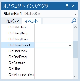
StatusBarをクリックして選択し、オブジェクト インスペクタのOnDrawPanelプロパティ右側の空欄をダブルクリックして StatusBar1DrawPanel 手続きを作成し、次のコードを入力します。
procedure TForm1.StatusBar1DrawPanel(StatusBar: TStatusBar; Panel: TStatusPanel;
  const Rect: TRect);
var
  ARect: TRect;
begin

  if Panel = StatusBar.Panels[0] then
  begin

    //文字色(このPanel内のみ有効となるようだ)
    StatusBar1.Canvas.Font.Color:= clBlack;

    //背景色(このPanel内のみ有効となるようだ)
    StatusBar1.Canvas.Brush.Color:= clBtnFace;

    //矩形を取得
    ARect:= Rect;

    //表示位置(中央寄せ)
    DrawText(StatusBar1.Canvas.Handle, PChar(Panel.Text), -1, ARect,
      DT_CENTER or DT_VCENTER or DT_SINGLELINE);

  end;

  if Panel=StatusBar.Panels[1] then
  begin

    //文字の表示(このPanel内のみ有効となるようだ)
    StatusBar1.Canvas.Font.Color:= clBlack;

    //背景色(このPanel内のみ有効となるようだ)
    StatusBar1.Canvas.Brush.Color:= clBtnFace;

    //矩形を取得
    ARect:= Rect;

    //表示位置(左寄せ)
    DrawText(StatusBar1.Canvas.Handle, PChar(Panel.Text), -1, ARect,
      DT_LEFT or DT_VCENTER or DT_SINGLELINE);

  end;

end;
保存(Ctrl+S)して、実行(F9)。
文字列の色と背景色を変更してみましょう。Panels[0]の方だけ、コードを少し変更します。
  if Panel = StatusBar.Panels[0] then
  begin

    //文字色(このPanel内のみ有効となるようだ)
    //StatusBar1.Canvas.Font.Color:= clBlack;
    StatusBar1.Canvas.Font.Color:= clBlue;

    //背景色(このPanel内のみ有効となるようだ)
    //StatusBar1.Canvas.Brush.Color:= clBtnFace;
    StatusBar1.Canvas.Brush.Color:= clAqua;

    //矩形を取得
    ARect:= Rect;

    //表示位置(中央寄せ)
    DrawText(StatusBar1.Canvas.Handle, PChar(Panel.Text), -1, ARect,
      DT_CENTER or DT_VCENTER or DT_SINGLELINE);

  end;
保存(Ctrl+S)して、実行(F9)。
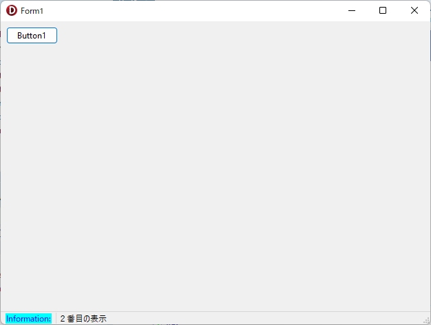
ボタンをクリックするとPanel[1]の文字列が変わるようにしてみます。
FormにButtonを1つ、追加して次のコードを書きこます。
procedure TForm1.Button1Click(Sender: TObject);
begin
  StatusBar1.Panels[1].Text:= '2番目の表示';
end;
保存(Ctrl+S)して、実行(F9)。
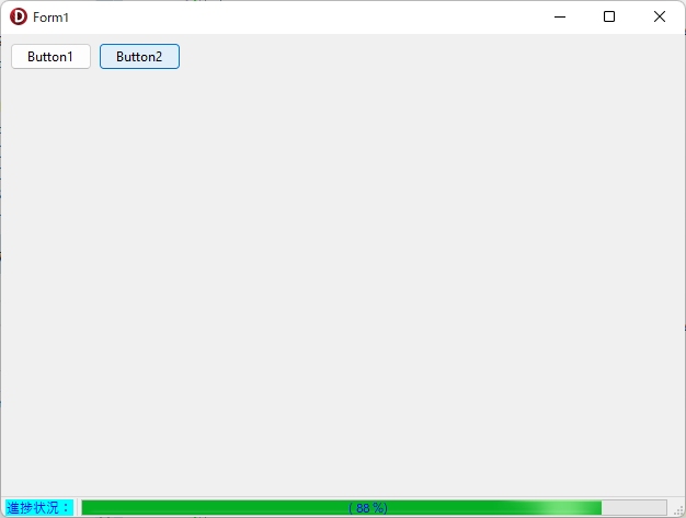
最初に紹介したように、進捗状況の表示に使うのであれば、Panel[1]の方にProgressBarを設定すればOKです。やり方は、次の通り(FormにProgressBarとLabelとButtonを1つずつ、追加してからコードを書きます)。
まず、ボタンをクリックした時の処理。こちらは全部新規に書きます。
procedure TForm1.Button2Click(Sender: TObject);
var
  i, j: integer;
  w: integer;
begin

  //進捗状況を表示するLabelの設定
  Label1.Visible:= True;
  Label1.Top:= 0;
  Label1.Left:= 0;
  Label1.Width:= ProgressBar1.ClientWidth;
  Label1.Height:= ProgressBar1.ClientHeight;
  Label1.Alignment:= taCenter;
  Label1.Layout:= tlCenter;
  Label1.Font.Color:= clBlue;

  //表示する文字列を設定
  StatusBar1.Panels[0].Text:= '進捗状況:';
  //Panel[0]の幅の調整(表示する予定の文字列で初期化)
  w:=StatusBar1.Canvas.TextWidth('進捗状況:');
  StatusBar1.Panels[0].Width:= w + 10;
  StatusBar1.Refresh;

  //Panels[1]の文字列は初期化
  StatusBar1.Panels[1].Text:= '';

  //ProgressBarの設定
  ProgressBar1.Visible:= True;
  ProgressBar1.Position:= 0;
  ProgressBar1.Max:= 100;
  //初期化
  j:= 0;
  for i:= 0 to 100 do
  begin
    //ProgressBar1.Position:=i; // -> MAXまで表示されない
    //値を増やす時
    j:= j + 1;
    If ProgressBar1.Position < ProgressBar1.Max Then
    begin
      //目的の値より一つ大きくしてから、目的の値にする
      ProgressBar1.Position:= j + 1;
      ProgressBar1.Position:= j;
    end else begin
      //最大値にする時
      //最大値を1つ増やしてから、元に戻す
      ProgressBar1.Max:= 100 + 1;
      ProgressBar1.Position:= j + 1;
      ProgressBar1.Max:= 100;
      ProgressBar1.Position:= j;
    end;
    //処理件数を表示
    Label1.Caption:='( '+IntToStr(j-1)+' %)';
    Sleep(25);
    Application.ProcessMessages;
  end;
  ProgressBar1.Visible:= False;
  StatusBar1.Panels[1].Text:= '終了!';
  ShowMessage('Done!');

end;
FormCreate手続きに処理を追加(赤文字の部分)。
procedure TForm1.FormCreate(Sender: TObject);
var
  w:integer;
begin

  //コードで設定
  //StyleをpsOwnerDrawに変更
  StatusBar1.Panels[0].Style:= psOwnerDraw;
  StatusBar1.Panels[0].Text:= 'Information:';

  //Panel[0]の幅の調整(表示する予定の文字列で初期化)
  w:= StatusBar1.Canvas.TextWidth('Information:');
  StatusBar1.Panels[0].Width:= w + 15;
  StatusBar1.Refresh;

  //StyleをpsOwnerDrawに変更
  StatusBar1.Panels[1].Style:= psOwnerDraw;
  StatusBar1.Panels[1].Text:= '最初の表示';

  //進行状況バーをステータスバーに配置する
  ProgressBar1.Parent:=StatusBar1;
  ProgressBar1.Visible:=False;

  //LabelをProgressBarの中心に表示
  Label1.Parent:=ProgressBar1;
  Label1.AutoSize:=False;
  Label1.Transparent:=True;
  Label1.Caption:='';
  Label1.Visible:=False;

end;
StatusBar1DrawPanel手続きの if Panel=StatusBar.Panels[1] then 部分にもProgressBarに関する処理を追加します(赤文字の部分)。
  if Panel=StatusBar.Panels[1] then
  begin

    //文字の表示(このPanel内のみ有効となるようだ)
    StatusBar1.Canvas.Font.Color:= clBlack;

    //背景色(このPanel内のみ有効となるようだ)
    StatusBar1.Canvas.Brush.Color:= clBtnFace;

    //矩形を取得
    ARect:= Rect;

    //表示位置(左寄せ)
    DrawText(StatusBar1.Canvas.Handle, PChar(Panel.Text), -1, ARect,
      DT_LEFT or DT_VCENTER or DT_SINGLELINE);

    //ProgressBarの位置を設定
    With ProgressBar1 do begin
      Top:=Rect.Top;
      Left:=Rect.Left;
      Width:=Rect.Right - Rect.Left - 15;
      Height:=Rect.Bottom - Rect.Top;
    end;

  end;
保存(Ctrl+S)して、実行(F9)。
以上がPanelを複数使用して、各々のPanelに対して文字色や背景色を設定する方法の解説です。
3.こんなこともできた! (その1)
他にも実現方法はたくさんあると思いますが、ユーザーに対して最初の1回だけは「とても重要な案内表示を行いたい」場合もあると思います。で、ユーザーが理解したことを(OKボタンを押すなどして)表明したら、もうその表示はプログラムが終了するまで出さない・・・みたいな処理をStatusBarを使って書いてみました。
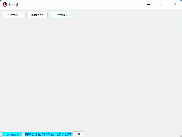
FormにButtonを2つ追加します。ここで解説に使ったFormをそのまま使う場合は、新しく追加したボタンはButton3とButton4になります。Button4のNameは「btnOK」、Captionは「OK」に、Widthは「40」、Visibleは「False」に変更します。で、次のコードを記述します。
  private
    { Private 宣言 }
    boolInfo: boolean;
表示の制御に使用するフラグをグローバル変数として宣言しました。続けてButton3をクリックした時の処理を書きます。
procedure TForm1.Button3Click(Sender: TObject);
var
  w:integer;
begin
  if not boolInfo then
  begin
    //制御用フラグを既読扱いに設定
    boolInfo:=True;
    StatusBar1.Panels[1].Text:= '最初の1回だけは表示したい案内';
    //OKボタンを表示する位置を設定
    w:= StatusBar1.Canvas.TextWidth('最初の1回だけは表示したい案内');
    btnOK.SetBounds(
      StatusBar1.Panels[0].Width + w + 5, 0, 40, StatusBar1.ClientHeight);
    btnOK.Visible:=True;
    StatusBar1.Refresh;
  end;
end;
FormCreate手続きに追加する処理です。
procedure TForm1.FormCreate(Sender: TObject);
var
  w:integer;
begin

  ・・・ 省略 ・・・

  //案内表示の制御用フラグ
  boolInfo:= False;

  //OKボタン
  btnOK.Parent:= StatusBar1;
  btnOK.Visible:= False;

end;
StatusBar1DrawPanel手続きの中の if Panel=StatusBar.Panels[1] then の内容を次のように変更します。
  if Panel=StatusBar.Panels[1] then
  begin

    //文字の表示(このPanel内のみ有効となるようだ)
    if not boolInfo then
    begin
      StatusBar1.Canvas.Font.Color:= clBlack;
    end else begin
      StatusBar1.Canvas.Font.Color:= clBlue;
    end;

    //背景色(このPanel内のみ有効となるようだ)
    if not boolInfo then
    begin
      StatusBar1.Canvas.Brush.Color:= clBtnFace;
    end else begin
      StatusBar1.Canvas.Brush.Color:= clAqua;
    end;

    ・・・ 省略 ・・・

  end;
グローバル変数を使用するので、Button1、2が押された時の処理にも制御用変数の初期化を忘れずに追加します。
procedure TForm1.Button1Click(Sender: TObject);
begin
  //制御用フラグを初期化
  boolInfo:= False;
  //表示
  StatusBar1.Panels[1].Text:= '2番目の表示';
end;
procedure TForm1.Button2Click(Sender: TObject);
begin
//制御用フラグを初期化
boolInfo:= False;
・・・ 省略 ・・・
end;最後に、ユーザーが表示された案内を読み、内容を理解したことを「OK」ボタンを押したというイベントから受け取ります。そのOKボタンの処理です。
procedure TForm1.btnOKClick(Sender: TObject);
begin
  StatusBar1.Canvas.Brush.Color:= clBtnFace;
  StatusBar1.Canvas.Font.Color:= clBlack;
  StatusBar1.Panels[1].Text:= '';
  btnOK.Visible:= False;
end;
これで他の動作モード(Button1や2をクリック)に切り替えない限り、1回OKをクリックすると、もうButton3を何度クリックしても案内は表示されなくなります。
以上、こんなこともできた!(その1) でした。
3.こんなこともできた(その2)
Panelを1つだけ用意して、次のように設定することで、文字列だけでなく、文字の色や背景色の変更も比較的簡単に実現できます。設定方法は次の通り。
重要な設定のポイントは2つ。
(1)StatusBarのSimplePanelは「False」に設定(デフォルト設定のまま)
(2)追加したPanelのStyleはpsOwnerDrawに変更(デフォルト設定はpsText)
さらに、これをコードでも設定しておけば、見た目にもわかりやすいと思います。
procedure TForm1.FormCreate(Sender: TObject);
begin
  //SimplePanelの設定
  StatusBar1.SimplePanel:= False;
  //StyleをpsOwnerDrawに変更
  StatusBar1.Panels[0].Style:= psOwnerDraw;
end;
準備ができたら、次の2つの手続きを作成します。
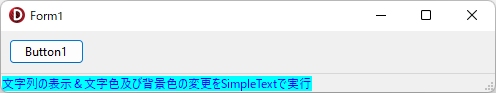
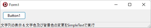
procedure TForm1.Button1Click(Sender: TObject);
begin
  //描画内容の指定
  StatusBar1.SimpleText:='文字列の表示&文字色及び背景色の変更をSimpleTextで実行';
end;
procedure TForm1.StatusBar1DrawPanel(StatusBar: TStatusBar; Panel: TStatusPanel;
const Rect: TRect);
begin
if Panel = StatusBar.Panels[0] then
begin
//Fontの色
StatusBar1.Canvas.Font.Color:=clBlue;
//背景色
StatusBar1.Canvas.Brush.Color:=clAqua;
//描画コード
StatusBar1.Canvas.TextOut(Rect.left, Rect.top, StatusBar1.SimpleText);
end;
end;保存(Crtl+S)して、実行(F9)。
記述するコードも少なく、比較的簡単に「色の変更」を実装できる方法なのではないか・・・と思います。ただし、さらに色の変更を追加したい場合などには、注意が必要です。それは何かというと、「色の変更の設定はStatusBar1DrawPanel手続きの中で行う」ということです。以下のコードは動作しません。
// 注意:このコードは検証用です。正しく動作しません!
procedure TForm1.Button1Click(Sender: TObject);
begin
  //Fontの色
  StatusBar1.Canvas.Font.Color:=clBlue;
  //背景色
  StatusBar1.Canvas.Brush.Color:=clAqua;
  //描画内容の指定
  StatusBar1.SimpleText:='文字列の表示&文字色及び背景色の変更をSimpleTextで実行';
end;

procedure TForm1.StatusBar1DrawPanel(StatusBar: TStatusBar; Panel: TStatusPanel;
  const Rect: TRect);
begin
  if Panel = StatusBar.Panels[0] then
  begin
    //描画コード
    StatusBar1.Canvas.TextOut(Rect.left, Rect.top, StatusBar1.SimpleText);
    //この手続きの中で更新を実行してはいけない(検証用に追加、すべて誤りです)
    //StatusBar1.Refresh;
    //StatusBar1.Repaint;
    //StatusBar1.Update;
    //StatusBar1.Invalidate;
  end;
end;
【参考】Refreshメソッド
https://docwiki.embarcadero.com/Libraries/Sydney/ja/Vcl.Controls.TControl.Refresh
保存(Crtl+S)して、実行(F9)。
ですから、Buttonをもう一つ追加して、押したボタンによって表示される文字や背景の色を変更したい場合は、グローバル変数「例 ColorMode: boolean;」を準備して、Falseなら青、Trueなら赤にする等、さらなる工夫が必要です。以下、その場合の例です。
private
{ Private 宣言 }
ColorMode: boolean;
procedure TForm1.FormCreate(Sender: TObject);
begin
//SimplePanelの設定
StatusBar1.SimplePanel:= False;
//StyleをpsOwnerDrawに変更
StatusBar1.Panels[0].Style:= psOwnerDraw;
//デフォルトの文字色は青
ColorMode:= False;
end;
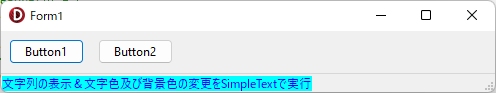
procedure TForm1.Button1Click(Sender: TObject);
begin
//色の設定はSimpleTextへの文字列の代入より先に行うこと!
//理由:SimpleTextへの文字列の代入即DrawPanel手続きが実行されるため
//色は青
ColorMode:= False;
//描画内容の指定
StatusBar1.SimpleText:= '文字列の表示&文字色及び背景色の変更をSimpleTextで実行';
end;
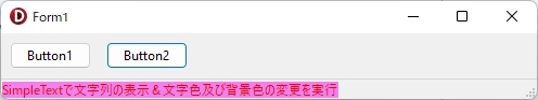
procedure TForm1.Button2Click(Sender: TObject);
begin
//色は赤
ColorMode:=True;
//描画内容の指定
StatusBar1.SimpleText:= 'SimpleTextで文字列の表示&文字色及び背景色の変更を実行';
end;
procedure TForm1.StatusBar1DrawPanel(StatusBar: TStatusBar; Panel: TStatusPanel;
const Rect: TRect);
begin
if Panel = StatusBar.Panels[0] then
begin
if not ColorMode then
begin
//Fontの色
StatusBar1.Canvas.Font.Color:= clBlue;
//背景色
StatusBar1.Canvas.Brush.Color:= clAqua;
end else begin
//Fontの色
StatusBar1.Canvas.Font.Color:= clRed;
//背景色
StatusBar1.Canvas.Brush.Color:= clWebViolet;
end;
//描画コード
StatusBar1.Canvas.TextOut(Rect.left, Rect.top, StatusBar1.SimpleText);
end;
end;保存(Crtl+S)して、実行(F9)。
さらに複数の色を使いたい場合は、TRadioGroup等を利用して、そこで色をユーザーに選択してもらい、StatusBar1DrawPanel 手続きでは、if文ではなくcase文を利用し、その中で RadioGroup の ItemIndex を参照して色を変更する方法が考えられます。
TRadioGroupを利用する場合は、StatusBar1.Refreshも実行する必要があるようです(実行するタイミングも重要!-> StatusBar1DrawPanel 手続きではなく、ButtonClickの中で行う。Refreshを実行する場所を間違えると、これがエンエンと呼び出され続け、画面の描画が非常に重たくなり、通常1つしか選択できないはずのオプションボタンが同時に複数選択状態で表示されるなど、TRadioGroupの挙動もおかしくなります)。
以下に、TRadioGroupを利用する場合の例を示します。
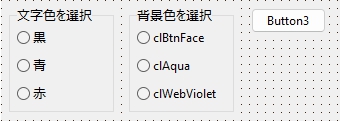
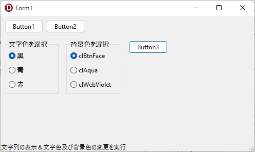
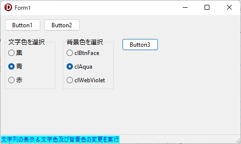
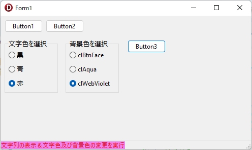
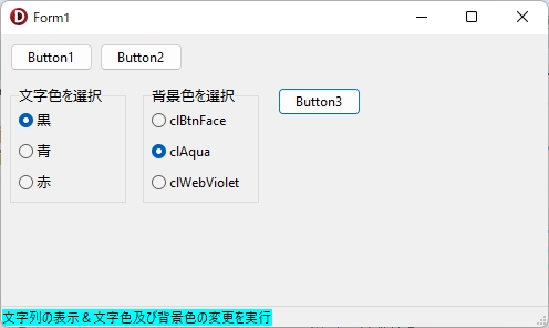
RadioGroup1のCaptionは「文字色を選択」、Columnsは「1」、Itemsは「黒、青、赤」、RadioGroup2のCaptionは「背景色を選択」、Columnsは「1」、Itemsは「clBtnFace、clAqua、clWebViolet」をそれぞれ指定します。
新しく追加したButton3をクリックした時のコードです。
procedure TForm1.Button3Click(Sender: TObject);
begin
  //描画内容の指定
  StatusBar1.SimpleText:='文字列の表示&文字色及び背景色の変更を実行';
  //更新
  StatusBar1.Refresh;
end;
StatusBar1DrawPanel手続きのコードは、次のようになります。
procedure TForm1.StatusBar1DrawPanel(StatusBar: TStatusBar; Panel: TStatusPanel;
  const Rect: TRect);
begin
  if Panel = StatusBar.Panels[0] then
  begin

    { //コメント化 -> 前に使った Button1 も Button2 もクリックしない前提です
    if not ColorMode then
    begin
      //Fontの色
      StatusBar1.Canvas.Font.Color:=clBlue;
      //背景色
      StatusBar1.Canvas.Brush.Color:=clAqua;
    end else begin
      //Fontの色
      StatusBar1.Canvas.Font.Color:=clRed;
      //背景色
      StatusBar1.Canvas.Brush.Color:=clWebViolet;
    end;
    }

    //文字色
    case RadioGroup1.ItemIndex of
      0:StatusBar1.Canvas.Font.Color:= clBlack;
      1:StatusBar1.Canvas.Font.Color:= clBlue;
      2:StatusBar1.Canvas.Font.Color:= clRed;
    end;

    //背景色
    case RadioGroup2.ItemIndex of
      0:StatusBar1.Canvas.Brush.Color:= clBtnFace;
      1:StatusBar1.Canvas.Brush.Color:= clAqua;
      2:StatusBar1.Canvas.Brush.Color:= clWebViolet;
    end;

    //描画コード
    StatusBar1.Canvas.TextOut(Rect.left, Rect.top, StatusBar1.SimpleText);

    //更新(ここに書いてはいけない)
    //StatusBar1.Refresh;
    //StatusBar1.Repaint;
    //StatusBar1.Update;
    //StatusBar1.Invalidate;

  end;
end;
保存(Crtl+S)して、実行(F9)。
StatusBarのPanelを利用して、そのStyleプロパティを「psOwnerDraw」に設定し、描画を自前で行う場合には広範囲に(コードの実行順等まで含む)様々な注意が必要です。
以上が「こんなこともできた!(その2)」の内容です。
4.まとめ
StatusBarの使い方はSimplePanel:= True; として、SimpleTextに指定した文字列を表示するというカンタンな方法と、デフォルト設定のSimplePanel:= False; のまま、Panelsプロパティで複数個のPanelを設定して、描画はStatusBar1DrawPanel手続きに自分で記述する方法の2種類があり、文字列の表示と色の変更だけならPanelを1個用紙して、SimpleTextを利用する、中間的な方法で「文字列の表示」と「表示色の変更」の両方を実装できる。
さらに複数の色を使いたい場合はRadioGroup等を利用して設定できるが、この場合は描画をRefreshする必要がある。StatusBar1.Refreshは、StatusBar1DrawPanel 手続きの中で呼び出してはいけない。
5.お願いとお断り
このサイトの内容を利用される場合は、自己責任でお願いします。記載した内容を利用した結果、利用者および第三者に損害が発生したとしても、このサイトの管理者は一切責任を負えません。予め、ご了承ください。